A self-initiated concept redesign of Lakeside Fitness 247 — a premium
24/7 gym with three locations across Virginia and North Carolina. The
project spans the full UX process from competitive research and
information architecture through a token-based design system,
responsive website and a branded native app concept.
A premium gym hiding behind a budget digital experience.
Lakeside Fitness 247 positions itself as a premium
transformation experience — "Not Just a Gym. A Transformation
Experience." — yet the digital experience significantly
undersells that promise.
The existing website is
built on Wix with a generic template aesthetic that reads closer
to a budget gym than an elite training facility. More
critically, members are handed a generic third-party Gymmaster
app — unbranded, feature-heavy and used almost exclusively for
Bluetooth door access. The brand promise of transformation
evaporates the moment a member opens the app.
A
competitive analysis of the Wilmington, NC market revealed that
Lakeside is the only gym attempting premium positioning in the
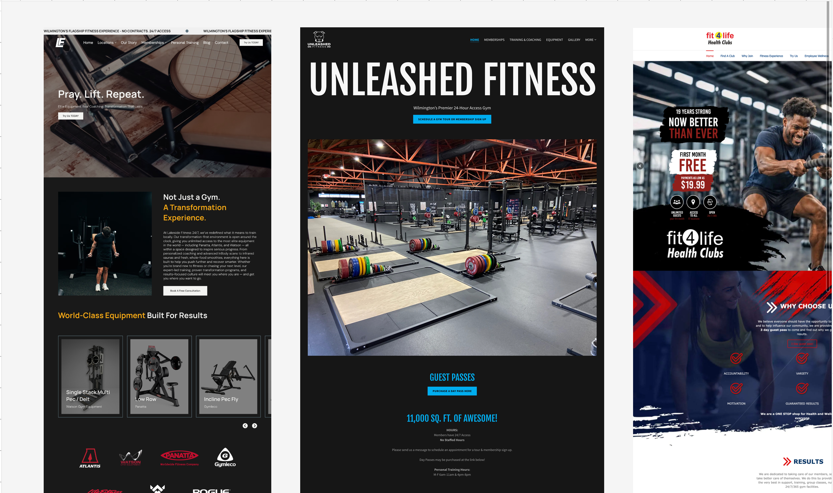
region — Planet Fitness, Anytime Fitness, Fit4Life and Unleashed
Fitness all occupy budget or no-frills territory. That
whitespace opportunity is being undermined by a digital
experience that doesn't communicate premium.
Before — lakesidefitness.com
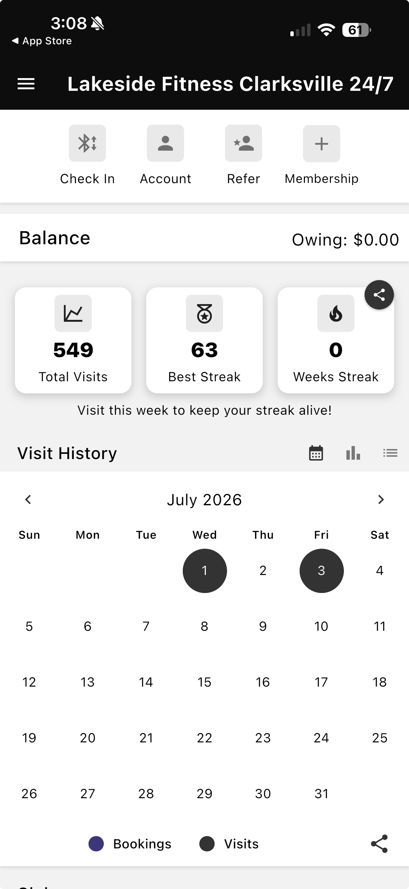
Before — Gymmaster App
Website built on Wix — generic template aesthetic, no brand
personality
App used almost exclusively for door access — zero member
engagement beyond entry
No unified design language across web and mobile touchpoints
Wilmington flagship positioning not reflected anywhere in the
digital experience
Three separate Instagram accounts with no unified brand strategy
Photography focused on empty equipment shots — no human energy
or transformation narrative
Research
Member Research
As a real Lakeside Fitness member at the Clarksville location,
firsthand observation provided genuine insight that no competitive
analysis could replicate.
The app is used for one thing — Bluetooth door access. Nothing
else
Classes are communicated via Instagram stories — no in-app
schedule
The check-in experience creates no brand moment — generic
loading screen, generic UI
Members who want to engage with the brand go to Instagram, not
the app
Key insight: The gap between the in-person experience and the
digital experience is enormous — and fixable.
Competitive Analysis
Benchmarked against four direct and indirect competitors to
understand the regional market and identify positioning
opportunities.
Planet Fitness — budget, judgment-free, no premium signals
Anytime Fitness — mid-tier, no digital differentiation
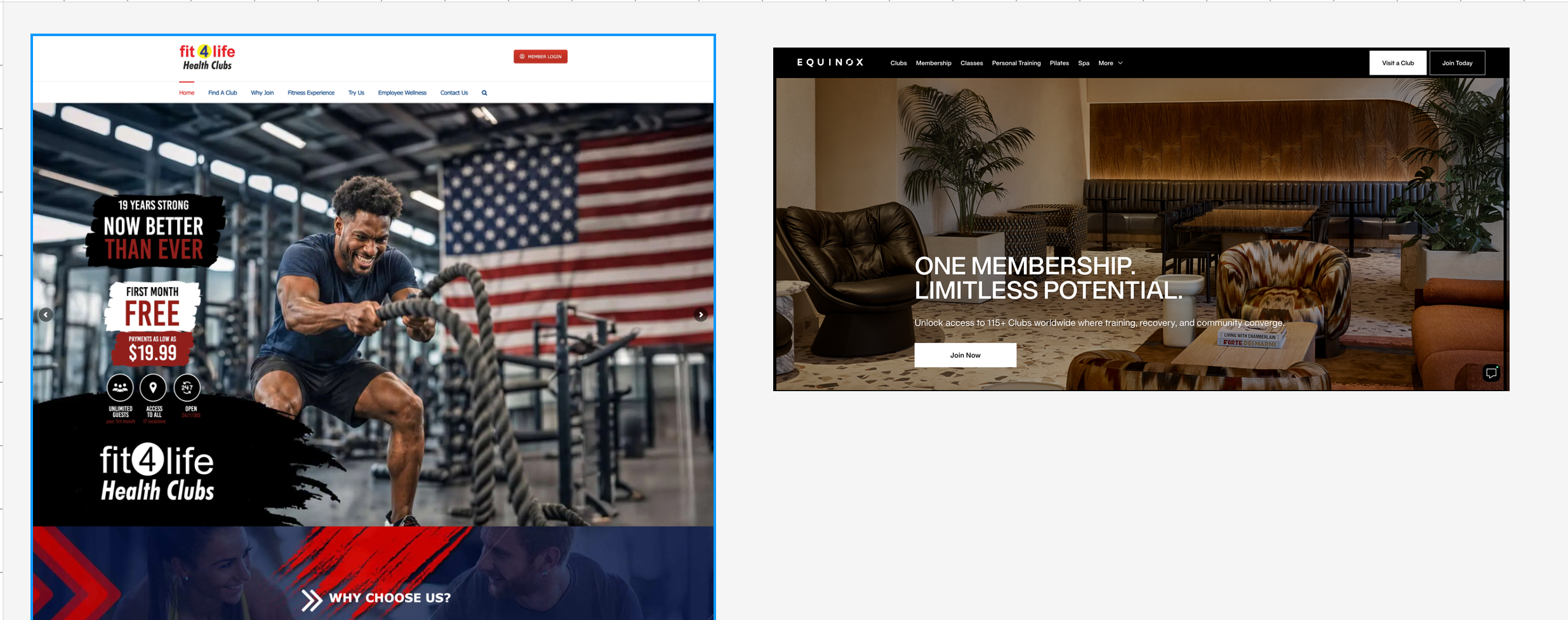
Fit4Life — family-focused, local, no app
Unleashed Fitness — performance-focused, no premium UX
Key takeaway: Lakeside is the only gym in the market attempting
premium positioning. No competitor is owning that space digitally.
User Personas
Five personas identified based on member observation, competitive
research and the gym's three-location context.
The Committed Regular — daily member, needs quick access and
progress tracking
The Class Attendee — schedule-driven, needs clear class
visibility
The Prospective Member — evaluating, needs trust signals and
tour booking
The Day Pass Visitor — passing through, needs quick access and
pricing
The Returning Lapsed Member — needs re-engagement and a reason
to come back
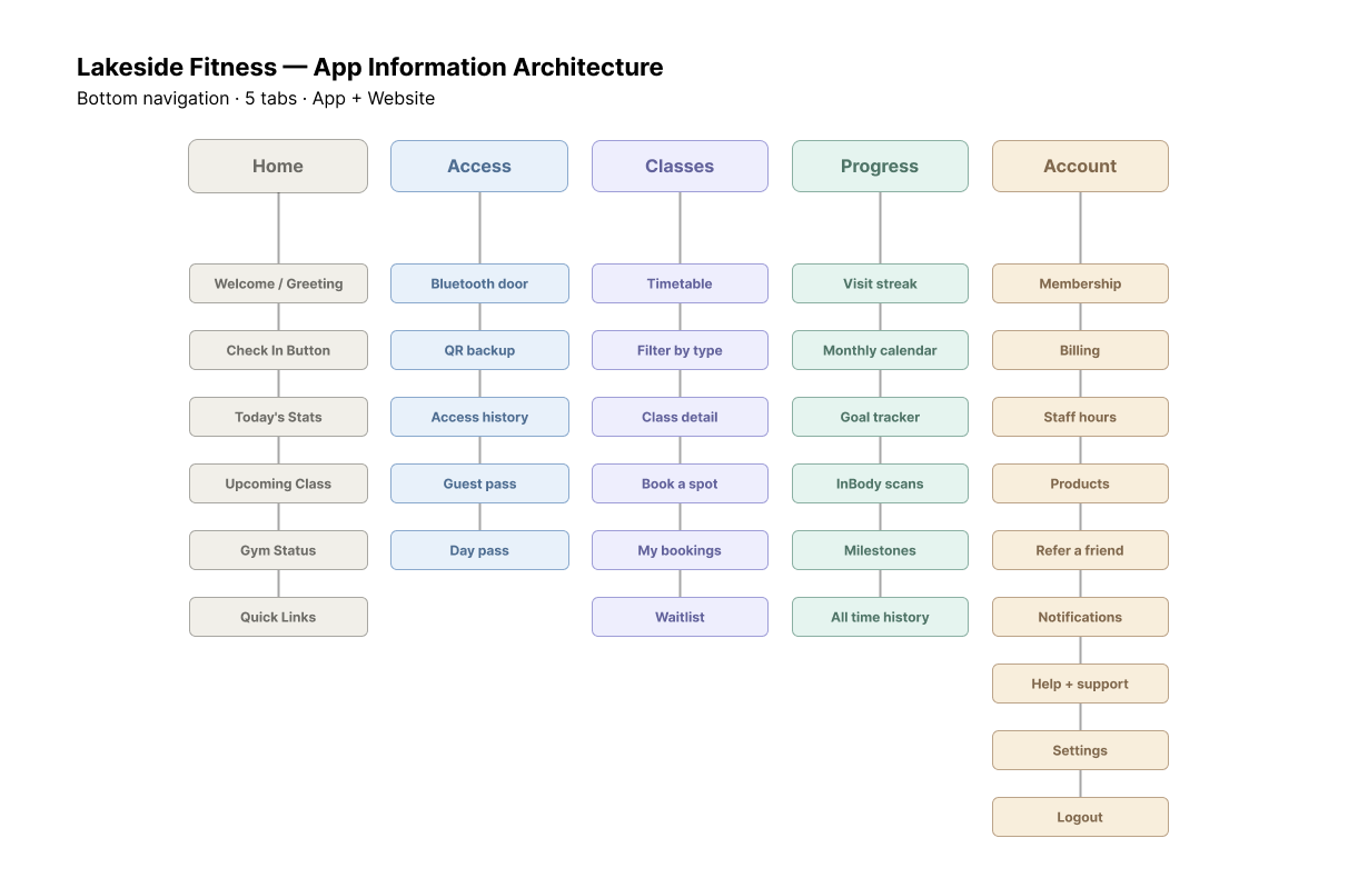
Information Architecture
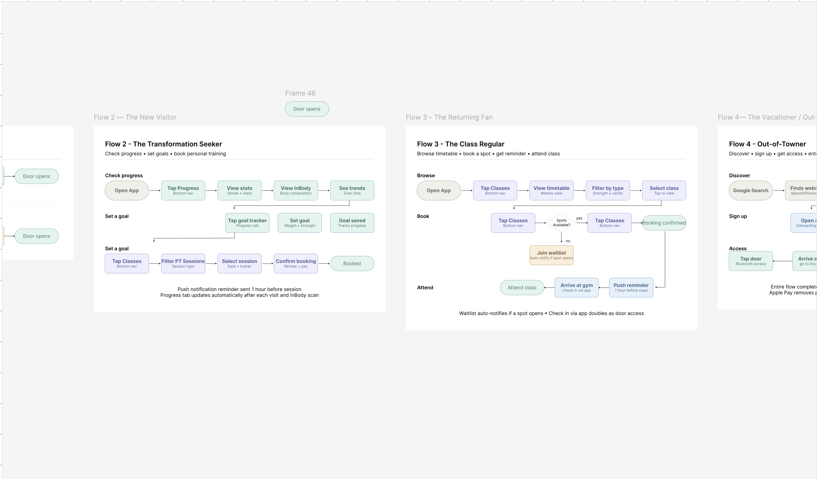
The IA covered two separate products — the website and the app —
each with distinct user needs, interaction patterns and
navigation logic. Both were mapped before any wireframes were
drawn.
Website — Primary Navigation
Home
Locations
Membership
The Experience
The App
App — Bottom Navigation (5 tabs)
Progress
Classes
Home
Access
Account
Home tab as the daily dashboard
The app Home tab surfaces today's class schedule, streak, and
location context — the most relevant information for a
returning member opening the app.
Access requires a deliberate tap
Door access is on its own dedicated tab, requiring a
deliberate action rather than a persistent background process
— preventing accidental unlocks.
Location-aware context switching
Home and Access screens automatically surface the nearest
location — removing the need to manually select a gym every
visit.
Website membership — monthly only
Monthly-only pricing displayed on the website honors the gym's
no-contracts brand positioning and simplifies the decision for
prospective members.
The Experience as a dedicated page
Amenities, equipment, coaching and the "Pray. Lift. Repeat."
ethos all live on a dedicated Experience page — separate from
membership — to serve prospective members at different stages
of consideration.
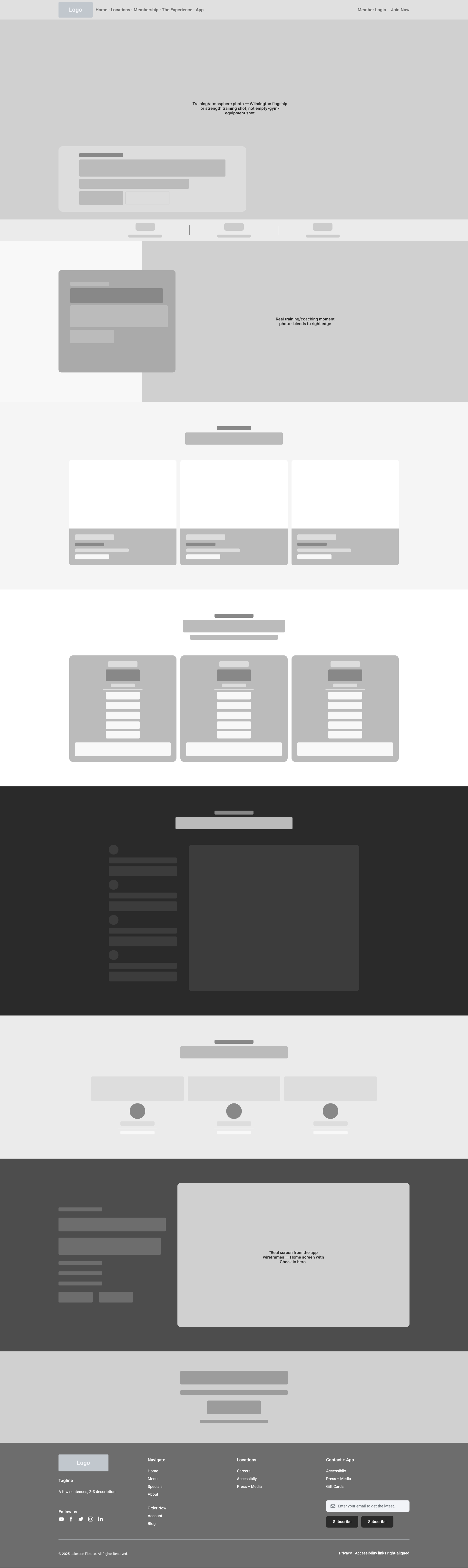
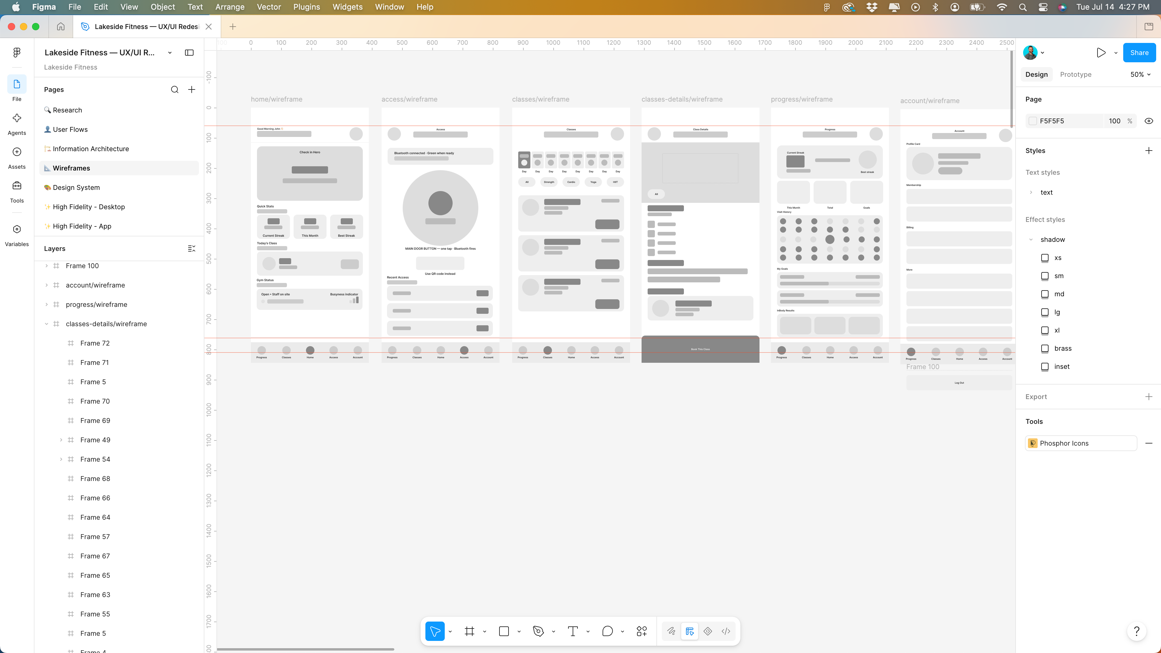
Wireframes
Low fidelity wireframes for every major screen across both the
website and the app before touching color, typography or
photography. The website homepage spans ten sections; the app covers
onboarding through all five core tab screens.
01
Ten Website Sections
Hero, Credibility Strip, Brand Promise, Locations, Membership
Tiers, The Experience, Client Testimonials, Free Tour Callout, App
Download, and Footer — each mapped before any visual design began.
02
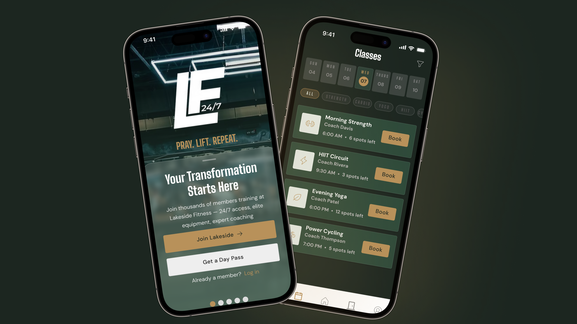
App Onboarding Flow
A five-screen onboarding flow covering welcome, goal selection,
membership tier, location selection and notification preferences —
front-loading the decisions that personalize the experience.
03
Check In as a Hero Moment
The Access tab centers a large Check In button with a subtle pulse
animation — making the most-used app action unmissable and turning
a functional moment into a brand moment.
04
Progress Tab for Retention
A dedicated Progress tab surfaces workout streaks, visit history
and milestones — creating an engagement loop that keeps members
returning and gives the app value beyond door access.
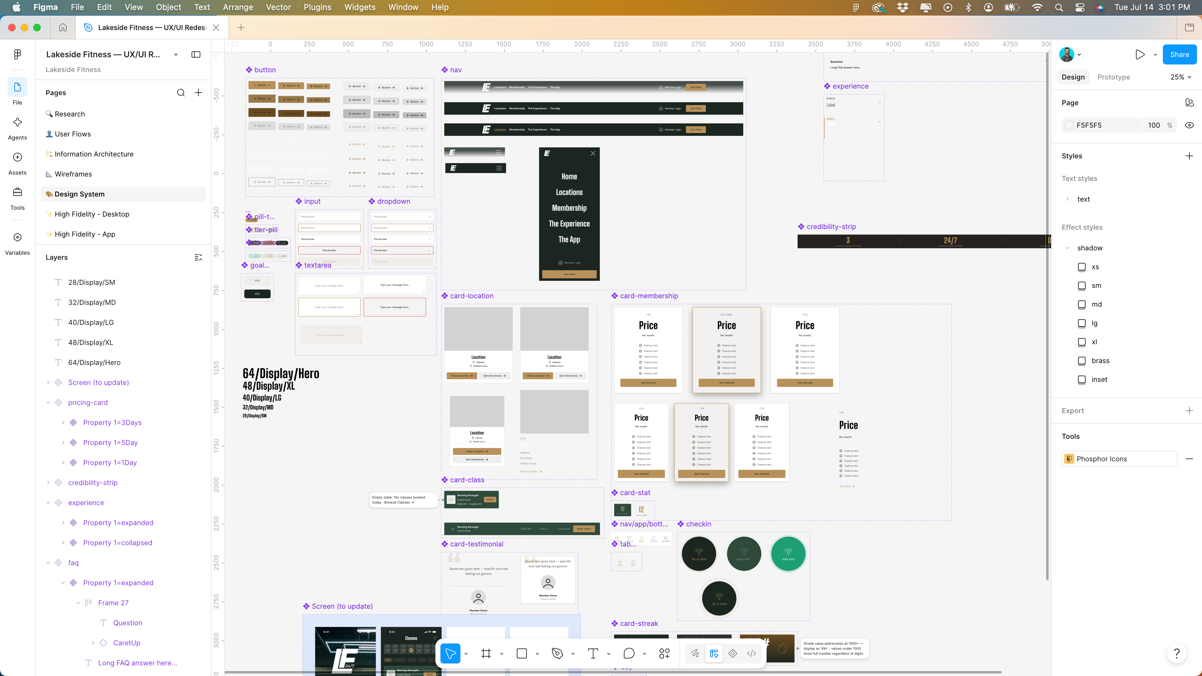
Design System
Color System
Deep Forest #1C2620
Warm Charcoal #26211C
Classic Brass #B8915A
Warm Off-White #F2EDE8
White #FFFFFF
Every color combination checked against WCAG 2.1. Dark text on
brass — AAA compliant. White on forest — AAA compliant. The brass
accent is used sparingly for maximum impact.
Typography
Display — Big Shoulders Display
Pray. Lift. Repeat.
Body — DM Sans
Not just a gym. A transformation experience — clean, warm and
readable at every size.
Token Architecture
A two-layer token system — primitive tokens (raw hex values)
referenced by semantic tokens (named purposes). Forest, Charcoal
and Brass scales built as primitives; backgrounds, text, borders
and buttons mapped as semantics on top.
Text styles
20+
Color tokens
40+
Components
30+
Web pages
5
App screens
15+
Card radius
0px web · 8px app
Design Decisions
0px card radius on web for an editorial, premium feel. 8px on app
for a modern native iOS feel. No card shadows — depth handled
through color contrast between surface layers. Column-with-divider
layouts over card grids on web — inspired by Equinox editorial
direction.
High Fidelity
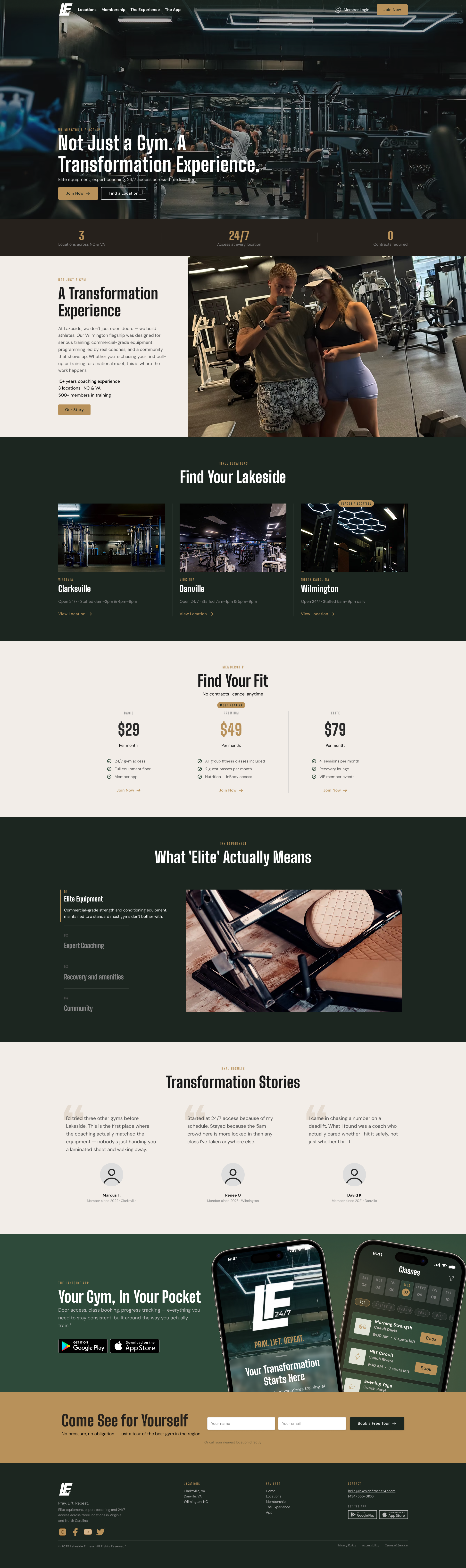
01 / 06 — Website Homepage
Premium Positioning from the First Scroll
The homepage opens with a full-bleed editorial hero — dark
forest background, brass accent type, athletic photography.
Ten sections tell the complete Lakeside brand story from the
hero through the app download CTA, with alternating light
and dark section rhythm throughout.
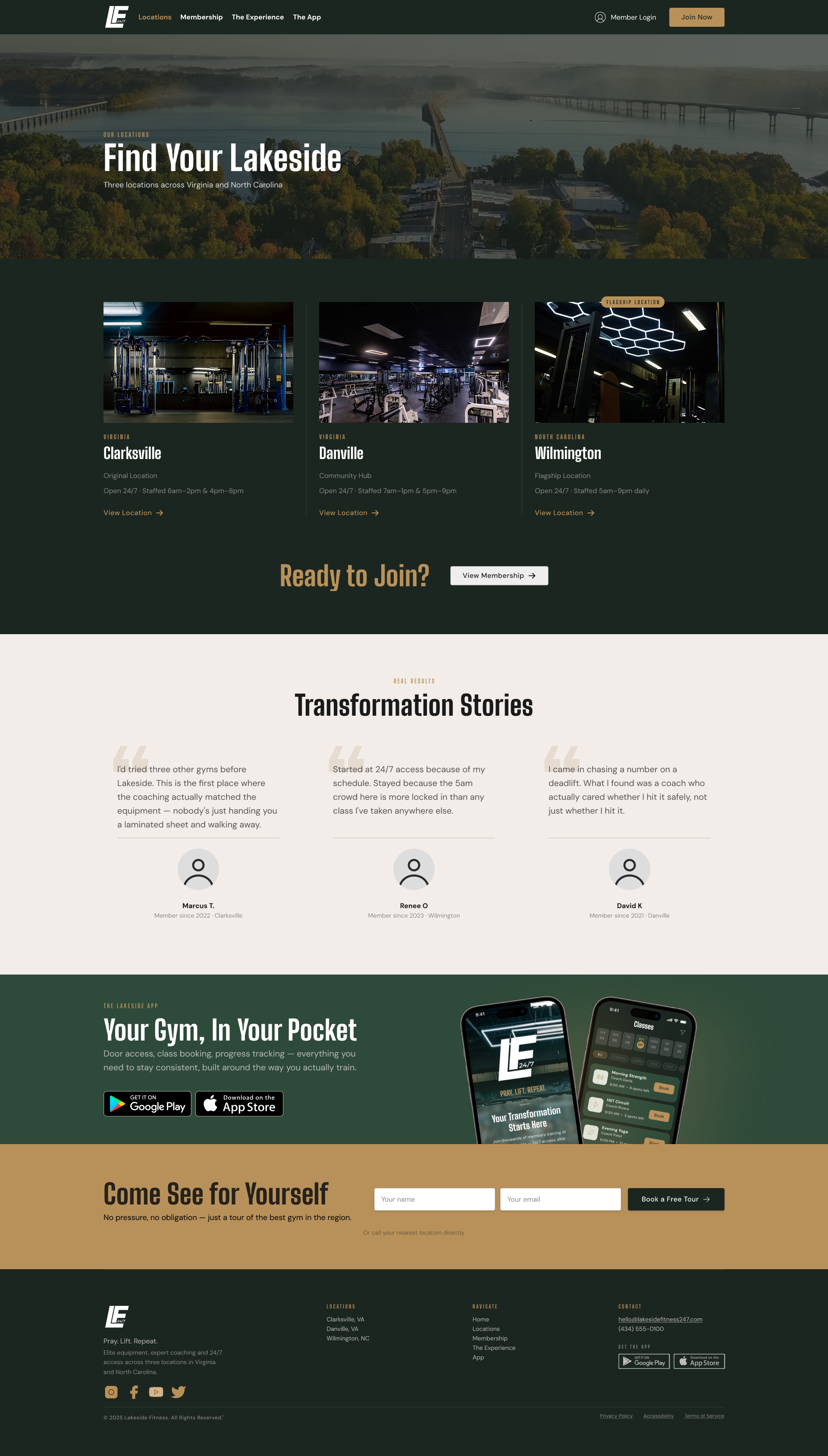
02 / 06 — Locations Page
Three Locations, One Unified Experience
The Locations page surfaces all three gyms — Clarksville VA,
Danville VA, and Wilmington NC — with hours, amenities and a
Get Directions CTA for each. An embedded map anchors the
page spatially. Consistent card structure across all three
locations reinforces brand unity.
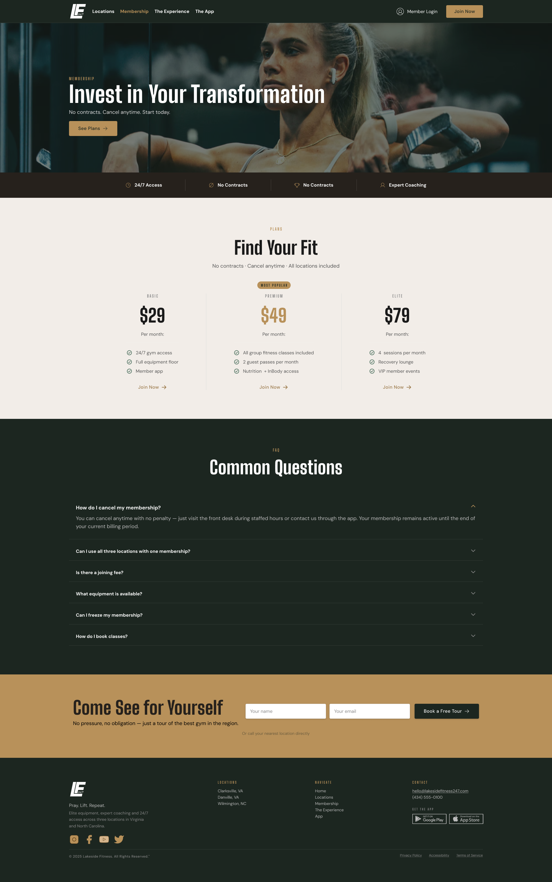
03 / 06 — Membership Page
Simple Tiers, No Contracts
Monthly-only pricing presented in a clean three-column
comparison — Standard, Premium and VIP. The no-contracts
positioning is a feature not a footnote. A day pass tier is
surfaced below for visitors and trial members. Each tier
links directly to a sign-up flow.
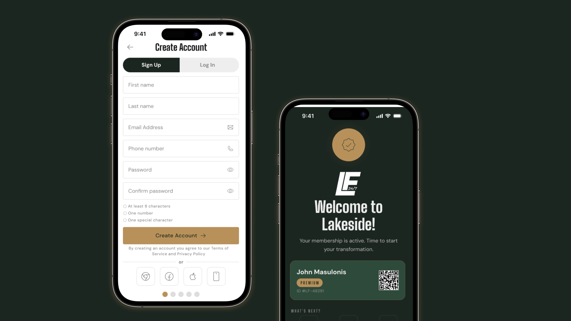
04 / 06 — App Onboarding
A Brand Moment from the First Screen
Five onboarding screens establish the Lakeside brand before
the member ever opens the door — welcome screen, goal
selection, membership tier, location selection and
notification preferences. Each screen is a deliberate brand
moment in forest and brass.
05 / 06 — App Core Screens
Five Tabs. Every Member Need Covered.
Progress surfaces streaks and visit history. Classes shows
today's schedule with one-tap booking. Home is the daily
dashboard with location-aware context. Access centers the
Check In button with a pulse animation. Account manages
membership, settings and personal details.
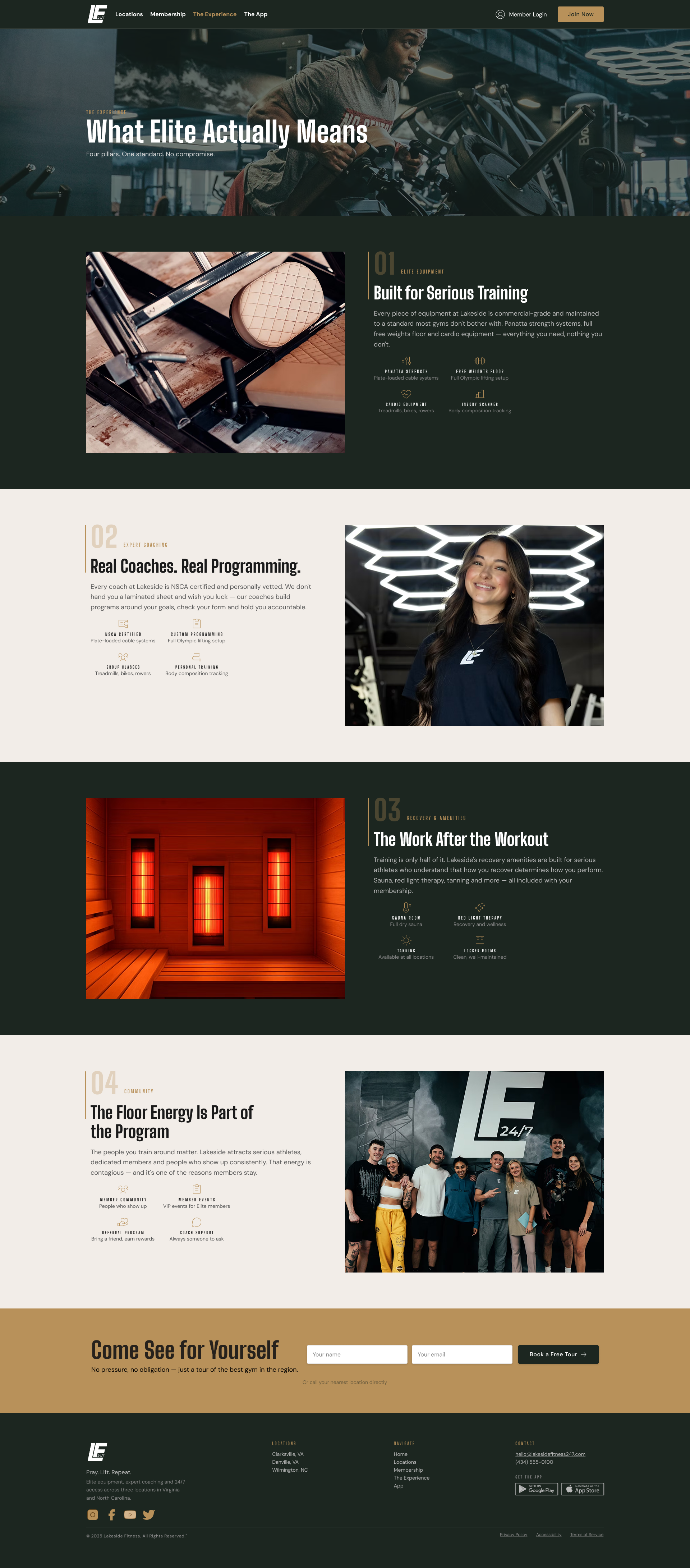
06 / 06 — The Experience Page
Sell the Transformation, Not the Equipment
The Experience page leads with the "Pray. Lift. Repeat."
ethos before listing a single piece of equipment. Amenities,
coaching profiles, recovery facilities and class types are
all presented in a dark editorial layout that matches the
intensity of the brand.
Results
Problem → Solution
Problems identified and solutions designed
Generic Wix website with no brand personality
Custom design system with editorial premium direction across
five pages
Unbranded third-party Gymmaster app
Fully branded native app concept with Lakeside identity
throughout
App used only for door access
Five-tab app with progress tracking, class scheduling and
member account
No unified design language
Single token-based design system spanning both web and app
Premium positioning not reflected digitally
Editorial aesthetic inspired by Equinox — dark, warm,
confident
Three Instagram accounts, no strategy
Unified brand account recommended with location-tagged
content
Empty equipment photography
Human-centered photography direction with transformation
narrative
Metrics to Track Post-Launch
App daily active users beyond door access
Class booking rate via app
Membership sign-up conversion rate from website
Day pass inquiry volume
Member retention rate vs. pre-launch baseline
Instagram follower growth under unified account
Tour booking submissions from The Experience page
Reflection
Being a real user changes everything
Designing for a gym I'm actually a member of gave the research
phase a depth that competitive analysis alone couldn't provide.
Firsthand observation of the Gymmaster app in daily use —
understanding exactly how and why members interact with it —
directly shaped the app architecture in a way that persona
creation from research alone wouldn't have.
Design systems compound across projects
Having built a full token-based design system for the Fishin'
Pig project first made the Lakeside system significantly faster
to build. The two-layer architecture — primitives then semantics
— was already a proven pattern. The time investment from the
first project paid dividends on the second.
Web and app are two different design problems
Designing both simultaneously required constantly switching
mental models — editorial column layouts for web, native iOS
patterns for app. The decision to give the app 8px card radius
while keeping web at 0px wasn't arbitrary — it reflects the
different aesthetic expectations of each platform and the
different relationship users have with each.
What I would do differently
User testing on the app onboarding flow — specifically the day
pass tier pricing and the goal selection screen — would validate
or challenge decisions made from competitive research and design
intuition. Earlier photography art direction would also have
improved the high fidelity phase, replacing the
section-by-section hunt for placeholder imagery with a coherent
visual direction from the start.
Final Thought
Lakeside Fitness 247 is a genuinely serious gym hiding behind a
digital experience that doesn't take it seriously. The equipment,
the coaching, the recovery amenities, the 24/7 access —
all of it is there. The "Pray. Lift. Repeat." ethos is
real. It just needed a design system, a unified experience and
someone willing to make it look as premium as it actually is.